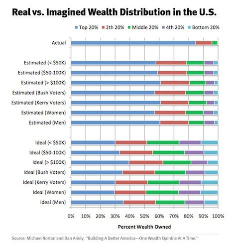
Americans have a really distorted view of how wealth is distributed in this country.
This chart is from a paper called “Building a Better America One Wealth Quintile at a Time” by Dan Ariely and Michael I. Norton.
The top row shows the actual distribution of wealth in America. The richest 20 percent, represented by that blue line, has about 85 percent of the wealth. The next richest 20 percent, represented by that red line, has about 10 percent of the wealth. And the remaining three-fifths of America shares a tiny sliver of the country’s wealth.
Below that, the “Estimated” rows show how different groups think wealth is distributed. As you can see, in people’s misinformed minds things are much more equitable.


